Friday, February 18, 2011
Monday, December 27, 2010
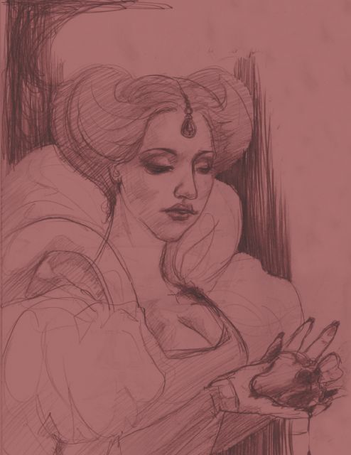
Sweetest Sin
Spent the last two days in the house, trying to use my time productively with the snow storm going on.
I finished this today...A very quick little painting, probably took less than two hours!
This was done very loosely with lots of transparent layers and a minimal color palette. I haven't had as much time lately to paint, and often found myself more frustrated when I tried. This piece was very relaxing to work on. I cranked Cake's "Motorcade of Generosity" album, sipped some hot cocoa, and just enjoyed the day.
 2.75"x5.75"
Acrylic on Birch Plywood
I finished this today...A very quick little painting, probably took less than two hours!
This was done very loosely with lots of transparent layers and a minimal color palette. I haven't had as much time lately to paint, and often found myself more frustrated when I tried. This piece was very relaxing to work on. I cranked Cake's "Motorcade of Generosity" album, sipped some hot cocoa, and just enjoyed the day.

Acrylic on Birch Plywood
Thursday, December 16, 2010
Dump It (the end-of-semester-smorgasborg)
"Why not just post more regularly?"
A VERY good question!
Unfortunately, I have no answer for that.
Here is a 2-part project from my Typography I class, a lesson on hierarchy.
The first is completely type and consists of 6 parts with specific limitations on how the type can be altered (line spacing, letter spacing, line weight, etc).


The next assignment used the same copy applied to a poster for the event. This one went through several incarnations. It progressed from dreadlocks to pure type to woven hemp to canvas to canvas patterns and finally paint splatter? The final product is much simpler than what I originally pictured but I find that that way, every component got a chance to hold together as a complete piece. Hurray, revelations!!

A VERY good question!
Unfortunately, I have no answer for that.
Here is a 2-part project from my Typography I class, a lesson on hierarchy.
The first is completely type and consists of 6 parts with specific limitations on how the type can be altered (line spacing, letter spacing, line weight, etc).
beginning:

end:

The next assignment used the same copy applied to a poster for the event. This one went through several incarnations. It progressed from dreadlocks to pure type to woven hemp to canvas to canvas patterns and finally paint splatter? The final product is much simpler than what I originally pictured but I find that that way, every component got a chance to hold together as a complete piece. Hurray, revelations!!

Monday, November 29, 2010
Time Time Time
It seems that lately I haven;t had enough time to draw ANYTHING! If its not work, its the computer, and if its not the computer, its sketching something for the computer, and if its not for the computer at all, its me sitting around wondering whether this was a good idea at all.
I'm taking time now in class to simply take a good, deep breath, and take a little time for myself. I've revamped the look...POPPIES! I was watching The Wizard of Oz last night, and I always find myself fascinated by the scene with the field of sleep-inducing poppies. Substance abuse in a classic movie? No waaaayyy. Despite that, I've always loved the idea of a big MOFO'ing field of amazing red poppies! If I ever get that dream mansion with the dual marble lion statues, I will have an immense poppy garden populated by midget giraffes, garden gnomes, and white rabbits.
This has nothing to do with my art. But I'll try to post more of that soon as well.
Wednesday, February 24, 2010
Copley Square + Boston Public Library
Copley Square is one of my favorite areas in Boston. Its flanked by the glass behemoth, the John Hancock building, on one side...and the fab shopping trap of Newbury Street on the other side. Walking down Boylston Street, the sight of Trinity Church against the JH Tower is really something else. Modern skyscraper meets Gothic Revival, its a pretty cool contrast.
 Right across the street is the Boston Public Library. If I had a really pimping mansion, it might look like the BPL...its just that sweet and one of the real crown jewels of Boston history and prominence. And who wouldn't want a pair of giant lions adorning your stairwell?
 Bates Hall is a beautiful, high vaulted ceiling room, and very conducive to intensive studying. But my favorite part might be the Abbey Room. Dark, molded wood, wide benches, with enormous paintings adorning the walls. The lighting is dim, and with the sunlight streaming through the windows, its almost unreal...serene. I can sit in the Abbey Room reading for hours, but it'd probably kill my eyes. :P

And here are a few sketches from this week :)


 Right across the street is the Boston Public Library. If I had a really pimping mansion, it might look like the BPL...its just that sweet and one of the real crown jewels of Boston history and prominence. And who wouldn't want a pair of giant lions adorning your stairwell?
 Bates Hall is a beautiful, high vaulted ceiling room, and very conducive to intensive studying. But my favorite part might be the Abbey Room. Dark, molded wood, wide benches, with enormous paintings adorning the walls. The lighting is dim, and with the sunlight streaming through the windows, its almost unreal...serene. I can sit in the Abbey Room reading for hours, but it'd probably kill my eyes. :P
And here are a few sketches from this week :)


Saturday, August 22, 2009
Bonjour mon lapin mignon!

So, after getting my image red carded by Photobucket as well as Blogspot, I can finally provide a (rather small and insignificant) update! I usually refer to my rabbits as conejos and conejitos...but he (yes, a he) seems much more suited to the French style. So lapin it shall be. If you'd like to see Blogspot's demon spawn upload of the image, direct your eyes below:
 I'd say evil lapin has his own charm as well as I keep looking at him. Maybe he'll make his own entrance someday.
Lapin came as a result of me realizing I haven't really touched Illustrator much this whole summer. I'll post some more paintings soon, but for the moment I've been sidelined by the digital programs. I'll be starting the fall semester at Bunker Hill Community College as a Graphic Design major (shh...this isn't betrayal, I swear!!) and I figured it would be poor showing on my part to pop into class as a transfer who sucks at digital art. Fail fail fail.
And for something to get giddy over, Brom is set to release his next illustrated novel, The Child Thief, inspired by the tales of none other than the puberty-stunted wonderboy Peter Pan.
I first picked up Brom's book The Plucker sometime last Spring, and I got hooked pretty fast. Brom's writing style is simple and the book is a pretty easy read if it weren't for the disturbingly perverse undertones. And his artwork...yeah, I'm not really verbally skilled enough to describe how much I love it. Its beautiful, its frightening, its freakin' amazing. Wicked pissah? Would that work?

Its set to release August 25...but of course there are lucky people in the loop who have already gotten their hands on it. *fans the flames of envy*
Thursday, June 18, 2009
Captain Zee (WIP)
 In progress portrait painting of Boston Bruins captain, Zdeno Chara (formerly of NY Islanders and Ottawa Senators).
This is the first of a series of sports paintings, since this is summer and nothing says summer like raw manpower.
That is all.
Wednesday, May 6, 2009
Disillusions
The older adaptations of the story of Snow White include the evil Queen demanding that Snow White's heart be given to her after she is killed. I find this one detail of the story to be so frightening. She draws similarities to the infamous "Blood Countess" Elizabeth Bathory, which isn't any more comforting. I've been told that the legends of Bathory bathing in the murdered maidens' blood is NOT true...but any fact on her history has been so permeated with fiction, that its hard to tell whats actually true.
I've been looking back at the art that influenced me as a child. Henry J. Ford's illustrations in the Fairy Books series were one of my early obsessions. I was too young to really understand the stories, but I remembered the illustrations fascinating and haunting me at the same time. Beautiful women, twisted trolls, both magical and horrifying at the same time. I learned that I loved artists like Edmund Dulac and Arthur Rackham earlier than I ever had the capacity to remember their names.
I don't think there's enough fairy tales for the older generation any more. I guess they would fall under the fantasy novel genre, or graphic novels, but I haven't found anything quite like the Fairy Books in modern publications. If anyone knows of some good books to check out, please inform me!!
Bexoxo
- Larissa
Thursday, April 30, 2009
Curly Straws

A quick, simple piece for W27.
Clean lines, happy colors. Makes me happy.
I like curly straws...and I actually like the concept of beer-hats as long as its not beer attached. Orange soda-hats, perhaps? Or BUBBLE TEA HATS?
I've been busy with final projects, so its nice to distract myself from work that HAS to be done. And English papers? So over it. Write it, get it done, pass it in, sleep some more, watch a lot of hockey and soccer. I'm writing a psychological literary critique on a Murakami short story, so it won't be completely miserable. Five pages, what?
I don't exactly make sense at the moment. Forgive me. I might blame it on the slow internet.
Tuesday, April 21, 2009
"Sangre"
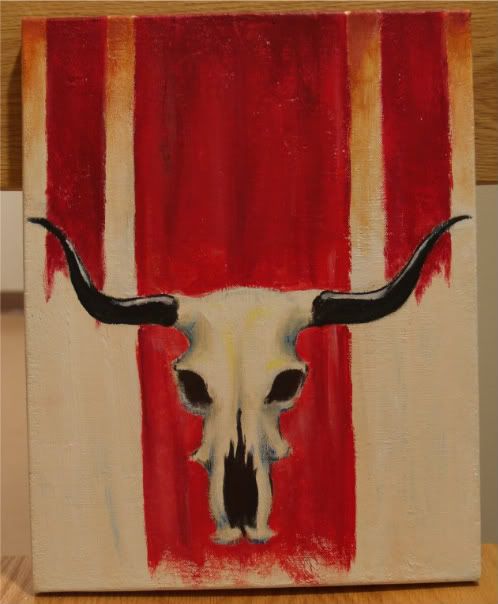 "Sangre" acrylic on canvas
This was something that took me ages to start, but not very long to complete. The original layout was completely different, and I think there's about a million layers of gesso packed on after each time I changed my mind. You can blame PMS, which would make the title "Sangre" very fitting...
My favorite part of this was the red banners. They were an unplanned decision (much like this whole painting was, oh hey!) but I think they pulled everything together well. Unfortunately, they started as a desperate attempt to "bandage" another mistake, and somehow became the most endearing part to me. The banners also gave way to the title.
It was a hair puller, to be honest. I think it should have been titled "Mi Sangre, mi dolor...MIERDA!"
-Larissa
(PS. Boston win game THREE of their first round with Montreal! LETS GO BRUINS!)
Subscribe to:
Posts (Atom)